
Figma Makeathon
Open Seat: A Social Signaling Tool for Spontaneous, Low-Stakes Connection
THE CHALLENGE
The Figma x Contra makeathon invited all creatives to use any Figma tools to test, design a solution to a problem. With such open-ended guidelines, my partner and I decided to use Figma's core values: community, empowerment and play to fuel our creation.
Role
Designer
Team
2 Designers
Timeline
1 week (June 2026)
skills
Figma Make, Jitter, Design Thinking, Prompting, ChatGPT
THE PRODUCT
Open Seat is a social signaling tool for people who want connection but do not want the pressure of planned events, algorithmic matching, or random approaches.
Instead of wondering if there are other people who are open to chatting, needing a gym buddy or wanting a study partner, Open Seat makes those invisible social intentions visible.


WHAT I DID
My Role
I was one of the designers responsible for Open Seat's end-to-end UX and UI design. I worked alongside my partner to ideate, iterate and prompt the visual direction and working prototype of our product. I also learned how to use Jitter to create the motion graphics for our video submission.
Problem
Many people find themselves alone in third spaces, wanting to connect and socialize but are unsure how to initiate.
Not everyone wants to go out of their way to sign up for an elaborate, paid, social event to meet others. Most times, having a simple, convenient and low-risk way of connecting can go a long way.
But how do people signal to others that they're open to interacting without making it awkward?
"Sometimes you don’t need more events to attend, you just need permission to approach."
DESIGN THINKING
Empathize, Define & Ideate
The problem was a personal one.
My partner and I found ourselves sitting on campus, looking around at students sitting alone or in small groups, scattered around the cafeteria.
We asked ourselves the question: How would we be able to meet with other people or show others in our vicinity that we would like company?
The question immediately made us think of how we wanted to position our product relative to pre-existing social products:
It's not a dating app
Users will not algorithmically paired with other people, nor will they have the ability to swipe on profiles.
It's not a meetup/event app
Users are not purposefully going out of their way to attend highly curated (and possibly paid) events.
It's not a professional networking app
Users are not gaining anything other than an invitation of socialize and connect in person.
THE PROCESS
Key Design Decisions
User Flow

THE FIRST
The Duolingo Inspired Iteration
The first iteration of our prompt covered the main necessities (i.e. information architecture, copywriting tone, visual direction), however it didn't contain enough substance for Figma Make to generate a final, submission-worthy prototype.

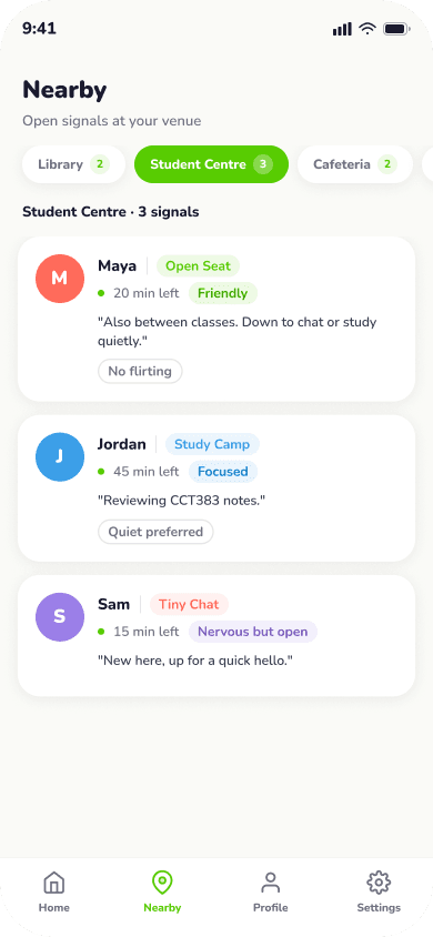

Looking at this first prototype prototype, we felt this style catered more towards children.
Instead, we opted for a different visual direction that incorporated orange as the main brand color since it aligned well with the playful, social and positive theme while still targeting our main audience demographic.
THE NEXT
The New and Improved
My partner and I also went back to refine our prompt. Using ChatGPT Pro to create the foundation of the prompt, we talked about different features and flows we wanted to incorporate.
More importantly, we decided on what we didn't want to include on Open Seat (e.g. any gamification feature, algorithmic matching, paid features).

Our improved prompt was 48 pages long, with thorough instructions that covered the overall product experience, the visual design direction, the detailed interactions of each page, possible user paths and copywriting rules.
This was also pasted into Figma Make.
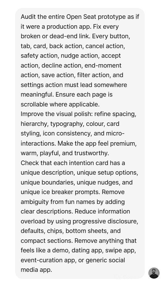
Though our prompt was thorough, we knew errors were still inevitable.
Right after Figma Make had finished generating, we gave it this audit prompt to self-correct any possible mistakes and dead ends before taking a look at the prototype.
BRINGING IT TOGETHER
The Final Prototype
Select Your Signal
We designed Open Seat with the main user flow being to set your social intention and show others what that intention is.
We designed our prototype in a way that reduces cognitive load. Users are provided with templates of common social situations, lessening the friction of having to manually input social intention.


Actually Meet People
From there, users can either send out a signal of connection or they can receive nudges to connect with others in their vicinity.
Users always have control over who they meet with visible intentions, clear boundaries and helpful icebreakers.


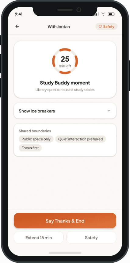
Easy Way Out
To keep the low-stakes and low-risk part of Open Seat, we decided to give users an easy way out if the social interaction didn't feel right. It maintains user agency rather than creating an unwanted commitment.

OUTCOME
…so we didn't win, but that's okay.
Looking at other people's submissions made us realize that the Figma Makeathon was less of an actual design case competition and more of a way of pushing the creative boundaries of Figma Make.
Nonetheless, we still built something that spoke to our personal values as designers and we were able to achieve this with an AI workflow.

REFLECTION
Learning to design using AI has taught me…
01: Designers must learn to be orchestrators
Designing with AI meant that AI was doing most of the grunt work while we as the designers did the decision-making. Knowing what tools to use and when to use them is crucial.
02: Iterate, iterate, iterate
No prototype will ever work as how you envisioned on the first iteration. It is only through thorough testing and prompting do designers get to see what needs fixing.
03: Subtract, don't add
Something I realized after using AI is that it has a tendency to add a lot more features than what was originally planned for. Being able to discern between what is necessary and what isn't is a key part of designing with AI.