
Designathon
Campus Connect: Group-First Social Connections App for First Year Students
Role
Designer
Team
2 Designers
Timeline
4 hours (March 2026)
skills
Figma, Prototyping, Mobile App design
THE GOAL
UTM's very first designathon
THE OUTCOME
I designed and pitched my mobile app prototype that showcased how I would implement a real-time translation tool that specifically centralizes non-hearing users abilities.

CONTEXT
The Gap
Most assistive technology for the non-hearing community isn't built for them. Think of your typical sign language learning app or an app that converts speech to text. These products are built with hearing users as the main target while non-hearing users are framed as passive recipients.
Problem
Plenty of apps teach teach sign language and yet none of them help non-hearing users communicate in the moment.
Squirl Signs flips this. They're currently creating a product that lets non-hearing users communicate to hearing individuals through real-time ASL translation via camera.
This distinction is how I shaped every decision I made.
RESEARCH
What I found
Good accessibility design demands the people you're designing for be part of the process. However, due to my school schedule and the time constraints, I couldn't do that here.
Instead, I compensated through deliberate research. Using Perplexity Pro to help me build a structured research space, I prompted it for a mix of academic and non-academic sources, then followed the thread of papers, videos and firsthand accounts.
Prompt used below:
Role: Act as an expert UX Researcher and Competitive Analysis Assistant specializing in assistive technology and accessibility products.
Context: I am prototyping an accessibility app. It uses the smartphone camera to provide real-time, two-way translation between American Sign Language (ASL) and spoken/written English to bridge the communication gap between Deaf and hearing individuals.
Task 1: Competitive Landscape & SWOT Analysis - Conduct deep research on existing ASL translation and assistive communication apps in the market. - Analyze traditional ASL learning/dictionary apps (e.g., Signily, SignASL, The ASL App) as indirect competitors, but heavily prioritize researching direct competitors utilizing real-time computer vision or AI sign language translation (e.g., OmniBridge, SignSpeak, SLAIT, or similar emerging tech). - Synthesize these findings into a concise SWOT analysis for my proposed app idea. Limit the SWOT to exactly 5 high-impact bullet points per category.
Task 2: User Research & Video/Interview Sourcing - Find specific, documented interviews, case studies, or videos that highlight the unique barriers, frustrations, and friction points Deaf and hard-of-hearing users experience with modern communication technology. - For every interview or video cited, provide a brief 2-sentence summary of the user insight and provide the direct hyperlinked source URL.
Scope & Quality Guardrails: Source Strictness: Rely strictly on data, articles, and reports published by established Deaf/hard-of-hearing advocacy organizations (e.g., NAD, World Federation of the Deaf), specialized accessibility research groups, or university human-computer interaction (HCI) labs.
Expert Presence: Media or articles must include direct quotes or insights from established Deaf community leaders, accessibility advocates, or Deaf engineers. Avoid generic tech blogs.
Output Deliverable: Provide a highly structured, professional UX Research Report. Embed the SWOT analysis cleanly, and ensure all video/interview sources are bulleted with active hyperlinks.
It wasn't a substitute for lived experience, but it was the next best option of secondary research I could run given the resources and time I had.
01: Accessibility shouldn't require extra effort
Non-hearing users shouldn't have to dig through menus or fight with settings just to use a basic feature. If accessibility is hidden, it isn't really accessible.
02:
High quality and discoverable captions
Most tools claim to prioritize accessibility, but ship captions that are inaccurate and impossible to customize.
03:
Not everyone expresses the same way
Some users sign. Some speak. Some do both depending on the situation. Designing a single communication mode and calling it inclusive misses the point entirely.
SOLUTION
The Logic
From my research, I gathered one main theme: accessibility shouldn't be something users opt into. It should be on by default.
User Flow & Sketches
FEATURE 01
Onboarding
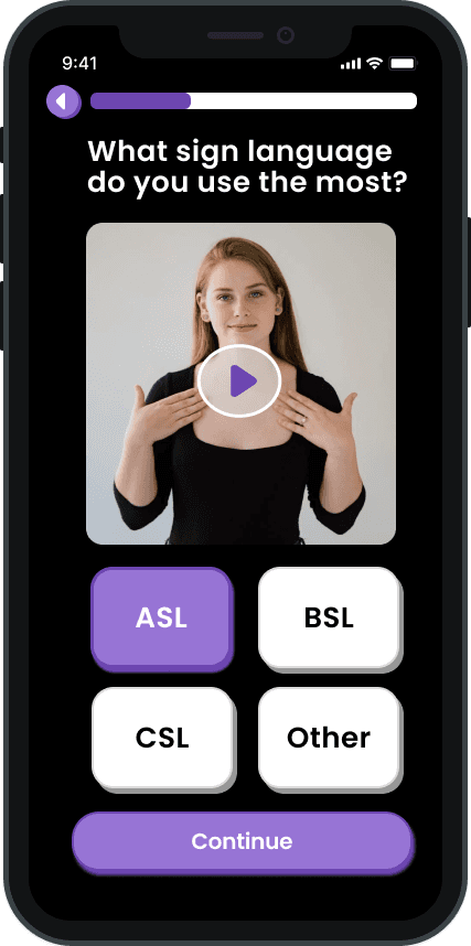
I designed the onboarding flow as a way to support the variety of communication channel preferences a non-hearing user may prefer.
These decision points included: preferred identity language (not all users want to be referred to as deaf), communications style (multiple sign languages exist), technology preferences (not all users prefer written text), and privacy consent (the app requires camera access to function).



FEATURE 02
Translation Screens
The core translation feature needed to work for two scenarios: a non-hearing user signing to a hearing person, and a hearing person speaking to a non-hearing user.
I designed a single toggle to switch between Sign-to-Speech and Speech-to-Sign modes as a way to address communication access fatigue in a simple manner.


I also incorporated visual guides on the translation screen to show users where to position themselves when signing to reduce failed signaling.
Captions are also on from the moment a user opens the translation screen, making it not a setting or option to enable but rather a default, and can easily be customized by pressing the 'Edit Captions' button.
FEATURE 03
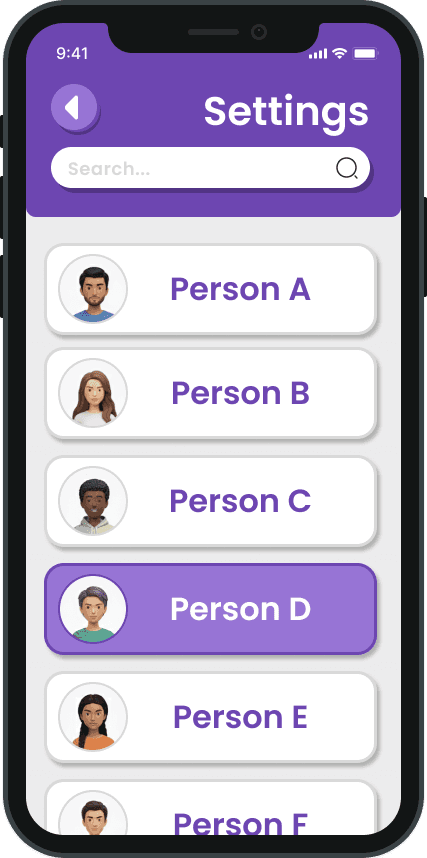
Accessibility Settings
To back up the customizable captions feature, I designed the core accessibility settings features. My design process was guided by a single question: what was the simplest version that still gave non-hearing users real control?
This section wasn't meant to be a menu that hid dozens of features. It was designed to be a straightforward path to connect user to customizing their experience.

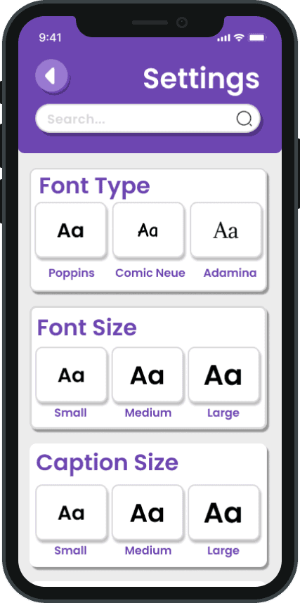

Looking back at it now, I realized I would do a few things differently such as making the font and caption sizing into a slider rather than limit users to 3 standard sizes.
RESULTS
What happened
After my pitch, the judges responded well to how I thoroughly documented and presented my process at every stage. I gained valuable feedback from industry professionals and the co-founders of Squirl Sign and ended up winning the competition.
This experience has taught me that good design needs to appeal to both the eyes and the mind. My ability to communicate the rationale behind my design and how I used my research to back up my decisions was more valuable to the judges than a pretty design with no research justifications.
LESSONS LEARNED
Designing for accessible communications has taught me…
01: Involve non-hearing designers from day one
Deaf activist, Nyle DiMarco, stated this in his talk with Google: involving non-hearing users in the design process is a must. No amount of secondary research can replace the input of their reality.
02: Simpler is almost always better
My initial instinct was to pack in dozens of features. In the end, I realized that a focused, well-reasoned prototype that satisfies the judgement criteria communicates more competence than a complex user navigational experience.
03: Dig deeper into WCAG compliancy
If I were to do this again, I would run a formal WCAG compliance audit. Even though I was mindful of the fundamentals (font size, plain language, color contrasts), doing a structured check at the end is best.
04: Design work is always going to be iterative
The bulk of my design process consisted of sketching, implementing of Figma and then re-sketching again. The purpose of my first few drafts were to make all my thoughts and ideas into something tangible.


…and though I intend on doing many more design competitions in the future, this one will always be my favorite :)
Shoutout to the ICCIT council for taking these photos!